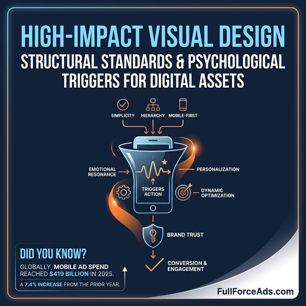
In digital advertising, the human visual system is the main filter for brand engagement. As people scroll through apps, stream connected TV, or browse web pages, their brains process thousands of visual cues every second, quickly sorting what matters from what does not. For growing businesses, getting attention isn't about personal aesthetic taste. It requires clear design choices grounded in visual structure.
High-impact ad design is not about making pretty banners. It is about using predictable visual triggers to guide user attention. When paired with direct media buying, clean visual structure helps convert passive views into action.
At Full Force Ads, based in Utah, we approach asset creation through an integrated campaign strategy rather than disconnected channels. Using our advertising platform, brands can launch, manage, and optimize cross channel campaigns across Streaming TV, Video, Audio, Mobile, Display, and Native from one place.
This guide outlines the layouts, psychological cues, and delivery methods that build effective visual assets across digital media.
Before a user reads ad copy, their visual system processes the overall layout. Visual hierarchy is the arrangement of size, placement, contrast, and layout to lead the eye naturally toward a conversion point.
People read digital content using predictable scanning habits shaped by web interfaces. Placing key elements along these natural visual paths helps ensure users process your main message.
Z-Pattern layout (best for display and mobile)
+-----------------------------------+
| [1] Primary Logo -----> [2] Offer |
|                     /             |
|                   /               |
|                 /                 |
|               /                   |
| [3] Hero Image ------> [4] CTA    |
+-----------------------------------+
The Gutenberg Diagram divides visual space into four quadrants: Primary Optical Area (top left), Strong Fallow Area (top right), Weak Fallow Area (bottom left), and Terminal Area (bottom right). The eye moves from top left to bottom right. Because of this path, putting your brand logo in the top left and your Call to Action (CTA) in the bottom right matches normal viewing habits.
The Z-Pattern works well for display banners and mobile ads with minimal text. The viewer looks across the top from left to right, drops diagonally down to the bottom left, and moves across to the bottom right. Placing your primary offer along this diagonal path makes sure it gets seen before the viewer reaches the CTA.
The F-Pattern shows up most in native ads and text-heavy layouts. Viewers sweep across the top, scan a shorter horizontal line below it, and then scan vertically down the left edge. Designing native assets to match this scanning habit keeps readers from skipping key information while scrolling fast.
Layouts without a focal point confuse the eye, causing users to scroll past. You can control visual weight using three main design choices:
Color is processed by emotion and memory long before someone reads the copy. In digital ads, color choices directly affect click rates and how people view a brand.
Color choices set the tone for your offer across different channels:
| Color | Main Reaction | Best Ad Application | Conversion Impact |
| Red | Urgency, Excitement | Limited-time offers, Retargeting | High immediate CTR |
| Blue | Trust, Stability | B2B, Financial services | Higher brand trust |
| Green | Growth, Health | Wellness, E-commerce | Steady conversion rate |
| Orange | Attention, Action | CTA buttons, Sale badges | High button clicks |
| Black | Luxury, Prestige | High-end display, Native ads | Raises perceived value |
Colors do not work in isolation. Ads need to fit the space where they appear. Native ads often work best when they match the colors of the surrounding website to feel natural. Display ads, on the other hand, often perform better with strong contrasting colors that stand out against dark mode browsers or bright mobile apps.
Text in an ad is a visual element. When users take less than two seconds to look at an ad, typography needs to convey the message instantly.
Simple, direct copy yields the best response:
An ad only works well if it fits the screen where it appears. Running a static desktop banner on a large TV screen creates a poor experience. To get the best results, tailor your ad formats to how people use each device.
Through Full Force Ads, advertisers can coordinate campaigns across six main media channels at the same time without managing separate vendor systems.
Unified Full Force Ads Distribution
┌──────────────────────────────────────────────────────────┐
│              Full Force Ads Engine                       │
└────┬──────────┬──────────┬───────────┬───────────┬───────┘
     │          │          │           │           │
┌────▼───┐ ┌────▼───┐ ┌────▼───┐  ┌────▼───┐  ┌────▼───┐ ┌────▼───┐
│Streaming│ │ Video  │ │ Audio  │  │ Mobile │  │Display │ │ Native │
│   TV    │ │Pre-Roll│ │Podcasts│  │ In-App │  │ Banners│ │In-Feed │
└────────┘ └────────┘ └────────┘  └────────┘  └────────┘ └────────┘
Connected TV puts your brand on large home screens through apps like Roku, Fire TV, and Hulu. Use a 16:9 widescreen HD video (1080p) in MP4 format, typically running 15 or 30 seconds. Put your logo and main message in the first 3 seconds. Since CTV audio is almost always turned on, match the voiceover directly to what is on screen. Keep a steady lower-third banner with your website URL or a QR code during the last 10 seconds so viewers can respond on their phones.
Video ads reach users across websites, apps, and video portals. Use 16:9 horizontal for desktop, 9:16 vertical for mobile, or 1:1 square formats. Hook viewers in the first 2 seconds before they scroll away. Since over 70 percent of web video plays with the sound off, use clear captions and bold text overlays so the message comes through without audio.
Audio ads run on Spotify, Pandora, and podcasts. Pair a clear audio track with a static 300x250 companion banner. Use a conversational voiceover with steady pacing and a clear verbal action request. The companion banner serves as the main click point on screen, so keep the text minimal, show your logo, and use a clear button that matches what the voiceover says.
Mobile formats reach users on the devices they check constantly. Common sizes include 320x480 full screen interstitials, 320x50 mobile leaderboards, and 300x250 medium rectangles. Put buttons near the bottom of the screen where thumbs can reach them easily during one-handed use. Mentioning specific city or neighborhood names can make the ad feel more relevant immediately.
Standard display banners offer broad reach across news sites and blogs. Core sizes include 300x250, 728x90, 160x600, and 300x600. Every banner needs three basic items: your logo, the core offer, and a CTA button. Simple HTML5 animations like gentle fade-ins work well, but keep them under 15 seconds. Avoid flashing effects, which annoy viewers and harm brand reputation.
Native ads blend into the layout and font choices of the surrounding website. They use a 1200x628 image, a logo, a headline under 60 characters, and a short description under 90 characters. Use authentic photos rather than overly polished stock images. Write headlines that sound like informative articles rather than sales pitches.
Great design still fails if sent to the wrong audience. Strong performance happens when clean visual assets match clear audience targeting.
Targeting Options
┌─────────────────────────────────────────┐
│     Geofencing & Location Intent        │
├─────────────────────────────────────────┤
│     Addressable Household Matching      │
├─────────────────────────────────────────┤
│     Site & Search Intent Retargeting    │
├─────────────────────────────────────────┤
│     Contextual Content Matching         │
└─────────────────────────────────────────┘
Geofencing draws virtual borders around real physical locations, such as trade shows, competitor stores, or specific business districts. Design ads that reference where the user is located. For example, an ad targeted at an industry conference might say, "Attending the event today? Visit booth 402 for a live demo."
Addressable tech takes customer address lists or CRM data and maps those street addresses directly to household internet networks. Since these ads reach verified prospects, you can skip general introductions and show specific, high-value offers across TV, mobile, and display.
Site retargeting shows ads to people who visited your site but left before buying or contacting you. Instead of showing them general brand ads, use retargeting creatives that display the exact service or product page they looked at, alongside customer reviews or star ratings.
Search retargeting shows ads to people based on terms they recently searched for online. Match your ad's main headline directly to those search terms. If someone searched for "fleet management software," use that phrase in your ad headline.
Contextual targeting places your ads next to related web content, articles, or videos. Build native or display ads that feel like a natural extension of the page topic. An ad placed next to a technology article should use a clean, data-focused design.
Choosing the right channel mix depends on your specific goals. Here is how media channels align with common marketing priorities:
| Goal | Channel Mix | Targeting Method | Creative Focus |
| Local Awareness | Mobile, Display | Geofencing, Radius search | Local branding, Clear address/map details |
| Competitor Conquesting | Geofencing, Display | Competitor location borders | Direct comparison, Clear reason to switch |
| Brand Building | Streaming TV, Video, Audio | Behavioral, Contextual | Cinematic video, Clear audio, Website URL on screen |
| Website Traffic | Display, Native | Search retargeting, Contextual | Informative headlines, Clear reason to click |
| Retargeting Visitors | Site retargeting, Display | Site pixel data | Specific product images, Testimonials, Direct CTA |
| Reaching Client Lists | Addressable TV, Display | CRM physical address match | VIP offers, Loyalty rewards, Direct upgrades |
Beyond basic layout, using simple principles of user behavior can improve your overall response rates.
People browse apps on autopilot, rapidly flicking past content. A pattern break is a design choice that interrupts that routine:
Reducing perceived risk helps when introducing your brand to new audiences.
Ad design requires ongoing adjustment based on real performance data. Maintaining steady conversion rates means testing different elements over time.
When testing your ad graphics, isolate variables one at a time:
Campaign performance relies on clear tracking. The Full Force Ads platform provides weekly performance reporting that shows where your ads ran, who saw them, and what actions were taken.
If data shows an ad is losing clicks over time, you can swap out the visual assets, update targeting, or shift spend to higher-performing channels. For teams wanting direct control, our platform at FullForceAds.app lets you launch campaigns, manage assets, and review analytics directly.
Creating strong ad graphics is only half the work. Delivering those ads to the right audience across screens without managing multiple vendors is what turns ad spend into measurable business growth.
Full Force Ads works as an integrated advertising partner focused on helping businesses scale with clear media execution.
Building an ad campaign involves a few straight steps:
Whether you want to reach local customers through Geofencing, build brand presence on Streaming TV, or bring past visitors back to your site with retargeting, success comes down to combining clean visual layout with targeted delivery.
Rather than managing separate ad tools, you can run a full-funnel strategy from a single platform.
To schedule a strategy demo and learn how our ad platform can support your business, visit Full Force Ads Advertising Solutions today.